
Blocks & components
Everything you need to build the interface.
Bootstrap-powered Gutenberg blocks for layout, content and interface components.
Section
Full-width wrappers with background, spacing and container options.
LayoutColumns
Bootstrap rows and columns with per-breakpoint widths.
LayoutGrid Builder
Multi-row grids built visually on the 12-column system.
LayoutStack
Vertical stacks with consistent gaps.
LayoutResponsive containers
Fixed and fluid containers that follow Bootstrap breakpoints.
LayoutSpacers
Responsive top and bottom spacing per breakpoint.
LayoutHeading
Headings that use the global type scale.
ContentRich Text
Paragraphs, lists and inline formatting.
ContentImage
Responsive images with aspect-ratio controls.
ContentIcons
Line icons sized and coloured from the global palette.
ContentButtons
Primary, secondary and outline buttons with icon options.
ComponentsCards
Content cards for features, posts and products.
ComponentsCarousel
Touch-friendly sliders for images and content.
ComponentsTabbed Panel
Accessible tabs for grouping related content.
ComponentsAccordion
Collapsible panels for FAQs and details.
ComponentsPopups
Modal dialogs for announcements and forms.
ComponentsBlock list compiled from the Zen Builder product graphics and brief — confirm against the current release.
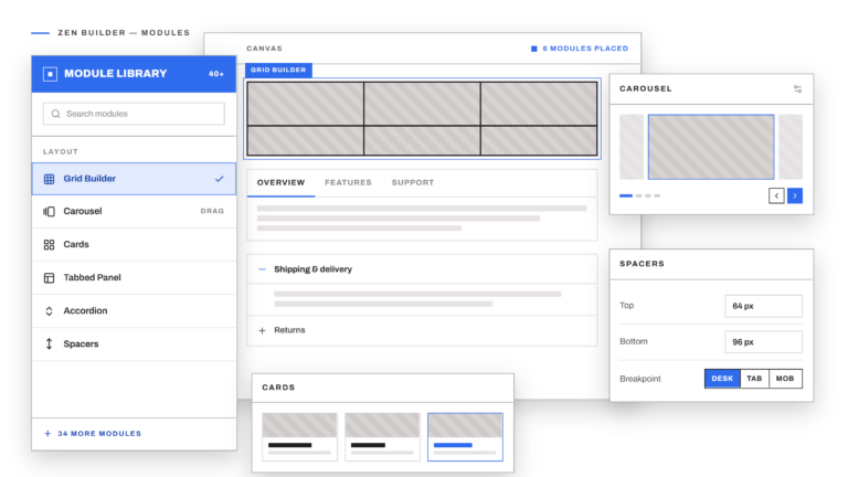
In the editor
Drag, drop and style. In WordPress.
Every block uses your global typography, colours and spacing, so pages stay consistent as the site grows.
- Inherits global styles from theme.json
- Per-breakpoint controls
- Semantic, accessible markup
- Works with core WordPress blocks
Ready to build better WordPress websites?
Start building with a WordPress system designed for speed, flexibility and professional results.
No page-builder lock-in. Just WordPress, Bootstrap and complete creative control.